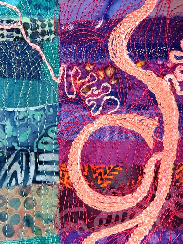
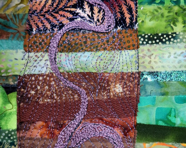
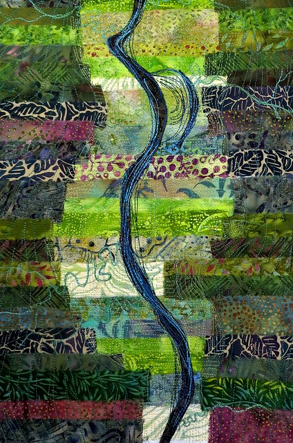
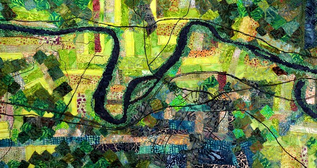
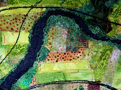
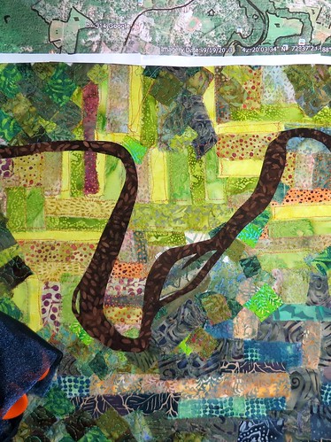
false color

river abstract 3 false color

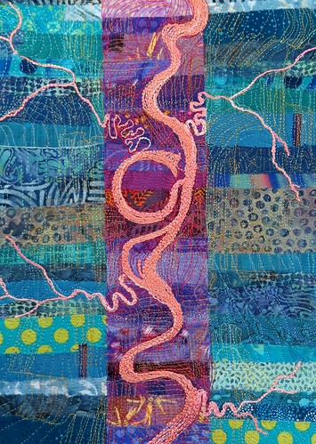
I think part of what makes me so fond of this one is the utter absurdity of the colors involved, and yet the forms of the river are all present.

When I worked with satellite images, particularly Landsat imagery, we would composite three bands of an image together using different colors for display. That sounds like murblemurble, I'm sure. False color shows what the terrain would look like, if you used different eyes; ones that could see in infra-red, or ultra-violet, or x-rays.

Earth Observatory has a very nice explanation, with examples.


abstracting continues

river abstract 2

This is the second one I've finished. I feel now like I should go look up what it means to be abstract, but I'm not entirely sure it would help.

I'm pleased with the lines and colors in this one, and particularly pleased about the places where the lines that indicate fields interact with the lines that indicate terrain.

No sooner was the above finished than I started the next. When I asked the kids what color the river valley was, if the hills were blue-green, three voices all said purple. Alice originally specified a redder color than I eventually chose for the river itself, but the whole thing is making me happy in a goofy, giggly kind of way:

river abstract 3 process

another run at abstraction

abstract river 2 process

One easy way to make something more abstract is to change the color scheme (and then simplify)(at least, that's the way I understand the process).

I started thinking this would be brown fabric with blue stitching again, but that dusty purple just called out to me, so I stitched the river (from the back) using perle cotton through the bobbin. The colors in the edges of the river still have a speaking relationship with the real world. I think for the next one I might go whole-hog otherworldly. There are some colors sitting in my room that I don't get to use often enough in landscapes.

Or, I might have to incorporate those colors in more of the landscape work I'm doing.

moonless night

moonless

I just finished this one tonight – it is a great deal of black and navy blue, and silver thread. Those are real constellations, if you choose to stare at it for a while. The reflections were … trickier.

What I am realizing is that taking time off to think or gather chi or inspiration doesn't work for me. I gather inspiration from effort expended. Each piece I finish leads me to think about something different, or how to show something in a new way. Each thing leads to a next thing. A break is counterproductive. Which is a good thing to know about oneself.

August full moon

august full moon

I finished the moon and stars this morning, and then re-reading the poem Janet wrote I realized I had drawn from my memories of a night on an island looking at stars and the moon, and hadn't actually rendered the imagery that Janet had put in her poem.

So this is my moony night, and I started another, moonless night, after a second, closer reading.

Els was right!

river abstraction process

A couple days back, Els said she was interested in seeing how I got to abstraction, because she generally failed on the side of realism. And as yesterday's post showed, so did I on that piece.

(You should totally click on that link, because she just finished an amazing felt book, and is working now what looks to be a crown with a story.)

On this one, I thought I had some good abstract stuff going down, and then the river went in, and it feels like I could, with a little effort, pinpoint this valley on the globe. Which, I hasten to add, would be tricky because really I was working hard to keep it simple and not representational at all!

I can try again, maybe smaller. But first I have to finish this one.

Valley, summer

valley and river summer

Every time I say someting I'm working on is big, Timna snickers at me, because my stuff is always, always small compared to her sizes. This one is 12×24" showing a fairly realistic view of the Connecticut River Valley from Hatfield to the Holyoke Range. North is to the left, which can confuse those who live for maps. It could probably hang either way; north up or east up, depending on the comfort levels of the individual who ends up owning it.

Below are two details from the above, one of the Hadley penninsula, some of the msot amazing farmland in the state, and one of the Northampton Meadows, a very similar texture of farmland but used quite differently.

meadows detail Hadley detail

map? sort of? or quilt? (not any more)

valley process july 2

For some reason, when I show the river, it is always brown. It shows up brown  or black on true color satellite images, which I worked with for a while, a long time ago. It shows up brown when I fly over it in tiny planes out of the local tiny airport. It looks brown (with some green) when I go over the bridge to and from everything. And yet every cartographic instinct I have tells me that water is always blue. It is what we call a cartographic convention. And I am so torn!!

Above you can see my lovely brown river (maybe it was from hearing the Just So Stories involving the great, gray-green, greasy Limpopo River) and while I love it, I also think it is not quite correct. 

So I tried an experiment overlaying a dark and sparkling blue organza over that brown. It looks like so:

IMG_1632

Since I am not at all sure, I thought I should maybe let it rest until tomorrow, when I will have had sleep.

Five a.m. is for the birds.