bench notes: thread weights

There are two paths to apply thread to work. The most used on a sewing machine is top thread – it follows the usual thread path from the spool to the needle, and through the magic of the lock stitch is looped around the bobbin thread and drawn back to the top of the work.

This little video shows clearly all the moving parts that make up a stitch. You can see that the top thread travels through several steps to get to the fabric. It also gets pulled back and forth through the eye of the needle as the take-up releases it for each stitch and takes it up again. This wear can be absorbed by finer threads running through appropriate sized eyes, and a wide range of threads can be used.

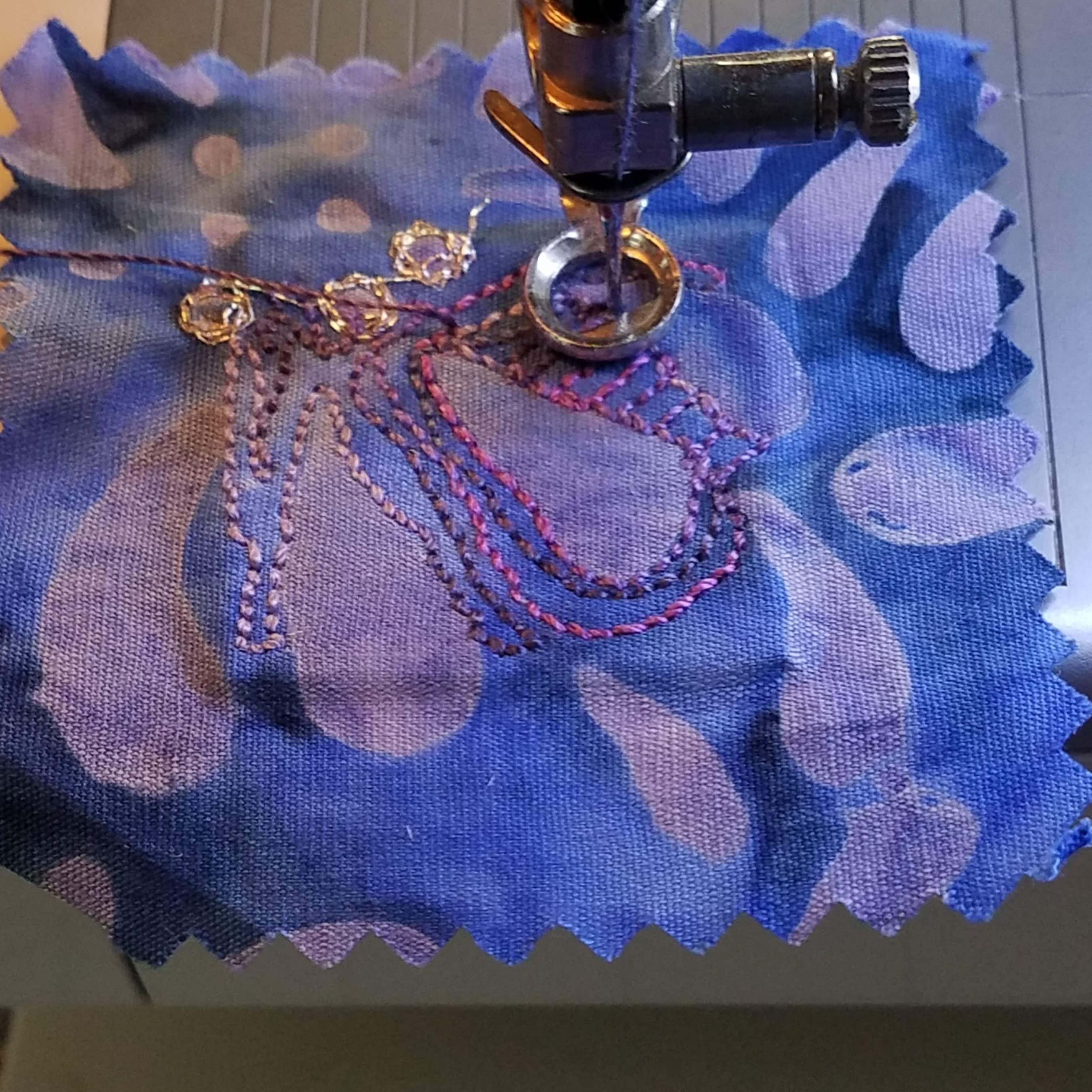
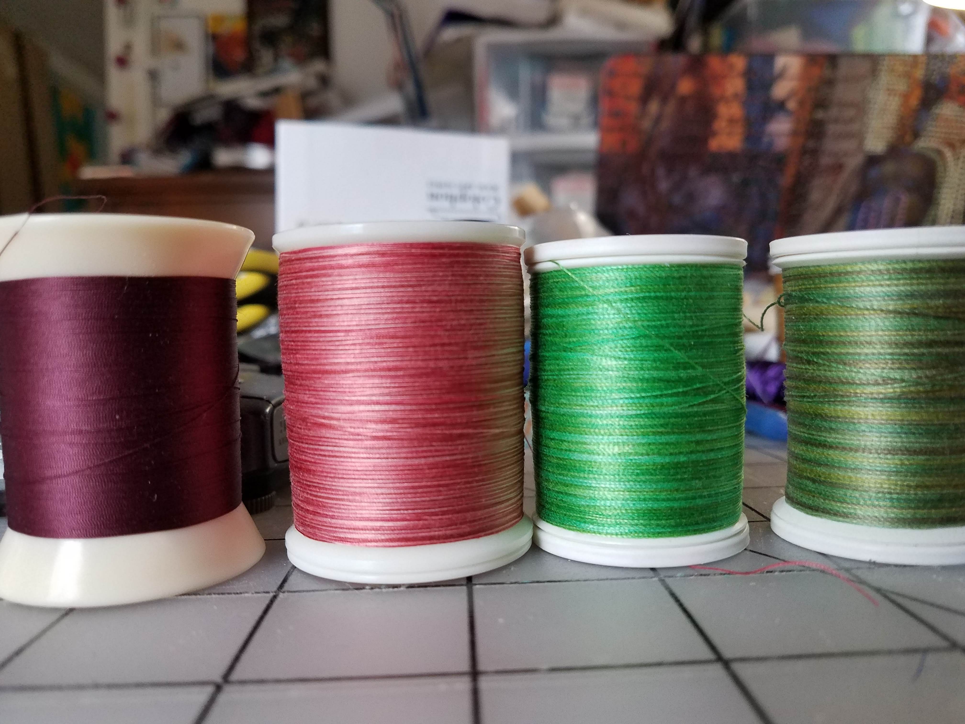
In a perfectly counter-intuitive move matched only by the wire industry, thread weights are inverse to the actual size of the thing in question. The 50wt thread on the left, from Superior, is the finest I tend to use because anything smaller than that does not cover the underlying fabric in any useful fashion. The weights increase to 40wt, also from Superior, 30wt, from Sulky, and 12wt from Sulky. All these are 100% cotton threads, and three of the four are also variegated threads.

Once threads are too coarse to fit through the eye of a needle, they can be wound on a bobbin and worked from the back of the piece. I’ll take some pictures of that process and demonstrate in the next bench notes.

bench notes: more thread

I wrote before about threads. This is a small sampler of four variegated threads I use routinely; three cotton, one rayon.

If you look at the samplers, you can see the Valdani and both Sulky threads have a long color change – there is a fair amount of each color on the thread. In close stitching, such as cobbling (small round circles) or small overlapping scribbles this long change gives depth and interest to the area covered. In lines, such as outlining or contouring or sketching, it means that the lines change color or character unless they are repeated, going back and forth over the line brings more different colors to it as well as making it a thicker line.

The King Tut, from Superior Thread, has a short color change, roughly every inch. This makes the thread read more like one color than several, as your eye averages the color within the area. I use these threads to blend different fabrics into a more cohesive mass. Because they are finer than the other threads, I also use them in the mid-ground and background of a piece.

I think the prettiest threads I use are the Sulky Blendable cottons – there are more different colors in one spool, and the patterns are more variable. I use these threads in the foreground of a piece, to keep details in the foreground from becoming an undifferentiated mass.

For a long time, I only knew of and used Sulky Rayon threads. They are easy to find, and come in many solid shades as well as the variegated versions. Rayon has a truly delightful sheen which is especially good for adding details and highlights to a subject, but it can get overwhelming in large areas.

Finding more variegated cotton threads, and variegations in different lengths, has helped my work evolve in a more painterly direction.

long drive into nostalgia

Monday I drove to Ipswich and back, the second drive in a week, to retrieve art that did not sell. The weather was perfect, I made good time, and I got to walk on the beach for while before I went home.

As I suspected, the large button river did not sell, and I got to take it home again. The two smaller pieces, sumac and milkweed, did sell. Trina Schell, the sainted woman who runs the sale, said some people had been asking after me, and were pleased to see my work again. She also had a list for how long I have had work in the show (since 2011) and what years art has sold (the smaller pieces generally sell). So I am feeling cheered about getting work to them, and maybe next year I’ll be organized enough to ship work instead of schlepping it.

Nostalgia comes into play because I grew up in Essex County. We lived in Marblehead, on the coast, for a while, and then further inland in Boxford, with horses and dogs and various farm animals, when I was in middle school and high school. The trip to Ipswich and out to Crane’s Beach is littered with memories of Pony Club and riding lessons, gallops on the beach and time with friends. And then my mother moved back to Ipswich when my first child was born. So I have another layer of memories, of my kids’ infancy and childhood, to drive through.

I don’t mean to complain – I had a happy childhood, and they tell me they did too – but it is a lot of time and memories to be sifting through when I should be paying more attention to the driving.

welcome to November

While I am fond of Halloween for costumes, candy and foolishness, my deep thinking about ghosts never seems to happen until November. Possibly I take the Day of the Dead too far in thinking of November as a month of memorials, or it could be that nature herself conspires to make me think of ghosts and endings.

I’ve been thinking about seeds that are distributed by the wind, especially since so many of them are in the air right now. The ones that leap to mind are, of course, milkweed and dandelions, but also thistles and sycamore and the humble cattail. Their combined insistence that November is about continuing on colors the way I see the leaves falling and the days getting shorter.

Fall weather

Monday I drove to Ipswich, taking three finished pieces for the Crane Estate art show and sale (Honestly, I am never sure what parts of that need capitalizing; too many and I feel like Pooh, not enough and I am closer to e.e.cummings). Two small works, one Milkweed and one Sumac, and the large shell button river.

The weather was damp and drizzly all the way there and back, which served to show off what had to be peak foliage along the way. The weather on the coast was substantially more exciting, with a combination of new moon tides and north east winds throwing the ocean around. I walked briefly around the outside of the Crane house, and started home again.

I think my next projects are more small works focusing on the fall leaves, berries and flowers that hang on after the first frost.

Sumac three ways

Sometimes I get stuck on a particular topic. The staghorn sumac berries were speaking to me. I finished the first one, with two colors of velvet providing depth and one variegated thread defining the berries. But!! I was not done! The second piece used one solid color of velvet for the body of the subject, and I added three different variegated threads to shade the shape. The third one I used heavy perle cotton in the bobbin, and worked upside down, over brown velvet. I used two related colors of thread to give lighter and darker sides.

There’s a modern, painterly feel of the first one, and it surprises me how much I like it. The second one has some delicate shading in it, but the background is … busy. The third one feels most like my usual work.

What do you think?

headed to Crane Estate

Milkweed and staghorn sumac finished, framed and ready to travel. The first weekend in November is the Crane Estate Art Show and Sale, to benefit the Massachusetts Trustees of Reservations. There’s a fancy meet and greet Friday evening, (nice canapes) and then the entire thing is open to the public and free on Saturday and Sunday. I’ve been lucky to participate for several years now. Seeing what other artists bring is amazing, and seeing what people buy is educational.

I have these two small pieces (6×6″) for the small works section, and I’m bringing the shell button river for a large piece. I hope someone will want it!

Shell Button River

threads

Frequently when I am making a piece, I check the back of it. Many people who see the backs say they are almost as interesting as the fronts (which is a distinctly mixed compliment) and wish there was some way to display both sides of a piece. I am amused by this, because the back is not the art, it is the supporting structure; the backs are more like backstage in a theater where a lot of work goes on to make the front look effortless and tell the story I am trying to tell.

This doesn’t mean I am not delighted with all the visible thread on the back, and on the front. While normally I use fabric for areas of color and texture, and add detail with stitching, sometimes a scene seems to lend itself to line work. For this barn, I pulled out all the gray threads I have, from shiny white to matte black and the in-betweens. Possibly the most unexpected thread I used has alternating sections of white and black, with no in-between shades. The color variation is so short, at one inch, there is no way to control what color goes where, so the resulting shrubbery and grasses look sun-dappled and unexpectedly deep.

While I like many threads for many different reason, I have a particular affection for variegated threads. Varigated thread works twice as hard as regular thread. It carries extra colors into an area, bringing depth and interest. It blends fabric edges, making softer, smoother transitions. I have an entire set of plastic drawers filled with threads, and it is slowly being overtaken by all the different variegated threads I can find.

Three of my favorite threads are Superior, Valdani and Oliver Twist. They all do very different things. Superior’s King Tut is a lovely smooth cotton thread with short, one inch variations. I use this a lot for adding texture to larger areas, and blending pieces together. Valdani makes a wide range of thread sizes as well as color variations. I use the finer threads for increasing depth and interest – since the color changes are longer. They also make perle cotton in gorgeous variations, which I can use in the bobbin when I work from the back. Oliver Twists is a small shop that hand dyes sets of variegated threads in different weights. They are unbelievably lovely and I want ALL of them. They have more colors per strand than anything else I use. Because of the weight and interest (and cost) I use these for emphasis in visually important areas. Also I gaze at them pleasure.

Bench notes: using tiny frames

Frames, laser cut from 1/8″ birch plywood, in various shapes. A different interfacing interfacing – this has no fusible on it, so I will fuse the fabric with Wonder Under.

Cut the interfacing to the size and shape of the interior shape. It works better, ultimately, if the interfacing is juuust slightly smaller than the inner shape.

Interfacing gets fused to the fabric backgrounds.

The interfacing adds a nice layer of padding when the frames are attached, and also works to keep the embroidered image smooth.

I like one more layer of interest on these tiny things, so I add a bead (or several) by hand. Then the work is placed over the interior shape, and the outside frame pressed gently into place. If it isn’t going to fit with minimal persuasion, make certain the fabric is smooth around the edge between the inside shape and the frame. Once it is in place, run a bead of liquid super glue on the back around the place where the fabric comes through from the front. Liquid superglue is important, because it soaks into the fabric between the pieces of frame, and holds everything together. I have done it with the gel super glue but the results are not satisfactory. Cheap superglue works really well.

Once the super glue is hardened, trim off the leftover fabric using whatever is handy. If you can’t find a sharp blade, a brisk application of sandpaper also works.

And behold! tiny scraps of fabric, small amounts of embroidery and some loose beads turned into something magical.